Cover Deep Dive
A book cover is one of the most important aspects of a book. In fact, I’d put it right up there with the story itself. It should be attention-grabbing and memorable while telling a reader where the book fits in a genre. It has to match the story within–it can’t look like a flashy, sparkling romance and then contain a horror novel. This piece of art must effectively communicate the surface level of a book at a glance and tempt someone to dive deeper. So, how did my book designer and I create the beautiful wrapping that contains Speak with the Dead? I’ll show you, step-by-step!
First, I needed to be prepared. I completed the first draft of the story and made sure I knew where the big edits were moving it. This allowed me to have a deep understanding of the themes, characters, and plot points that defined the book. From there, I could start thinking about what I wanted the cover to represent. You may have a firm grasp of this earlier or later than the first draft, and that’s okay! Just know that you shouldn’t start working on a book cover until you know the book.
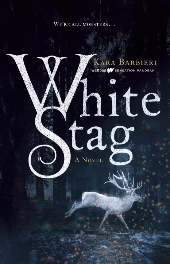
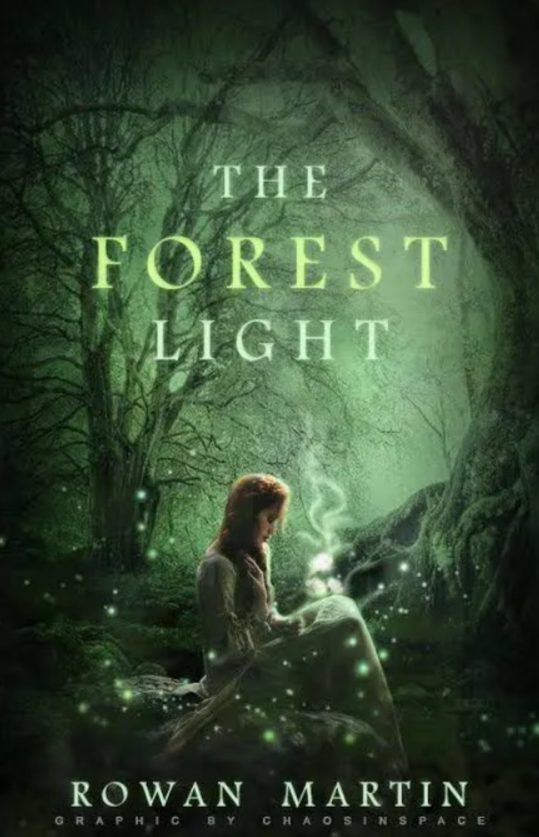
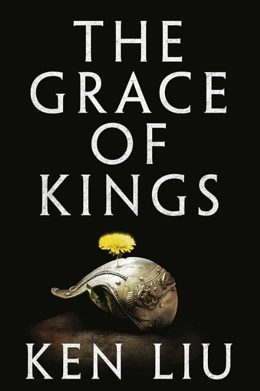
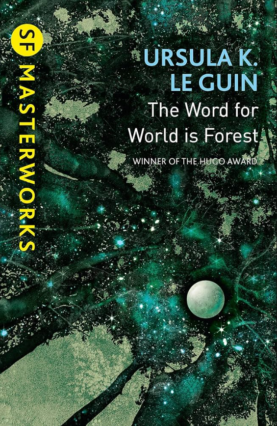
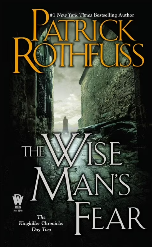
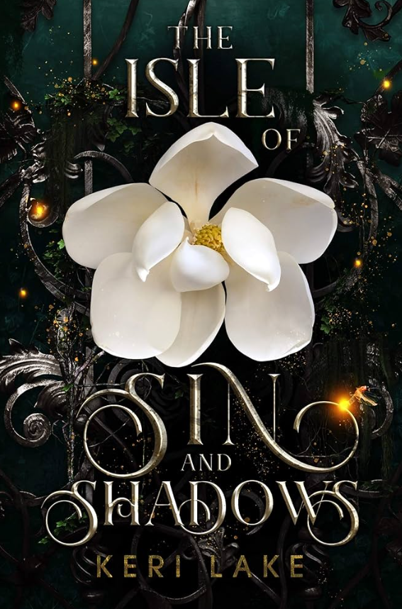
Next, I developed the concept I wanted the cover to achieve. Speak with the Dead is an epic fantasy that deals with themes of grief, hope in darkness, sacrifice, and heroism. It has strong characterization and character growth moving together with a plot that grows in action and speed as the story progresses. It’s dark at times, but funny at others. It’s inspired by classic fantasy and Dungeons & Dragons, but still fresh and new. I looked at covers of popular books in epic fantasy to understand genre expectations. I took those ideas and I asked myself what they look like visually. I was originally drawn to the illustration style of Arief Rachmad (@nenasmint on Insta). Their work feels very old-school Dungeons & Dragons, and the darkness with intentional use of color in each piece felt like what I was looking for emotionally. I was also drawn to Eleonor Piteira’s work (@eleonorpiteira on Insta). There’s a magical element to her work that makes each piece feel like it's full of lore. I even reached out to her and asked about a commission. Unfortunately, I couldn’t afford to work with her, but she is worth every penny and I hope to someday commission her! That will happen when you start getting quotes for work, don’t let it deter you. You can find the cover and art you want, you just have to keep looking for artists and designers in your budget, or save up over time for the perfect artist. Then I moved on to looking up book covers that I felt fit my book and the vibe I wanted to give off. The following were what I found: All Dears May Die by Tehya Metzinger, White Stag by Kara Barbieri, The Forest Light by Rowan Martin, The Grace of Kings by Ken Liu, The Word for World is Forest by Ursula K. Le Guin, The Wise Man’s Fear by Patrick Rothfuss, The Isle of Sin and Shadows by Keri Lake.
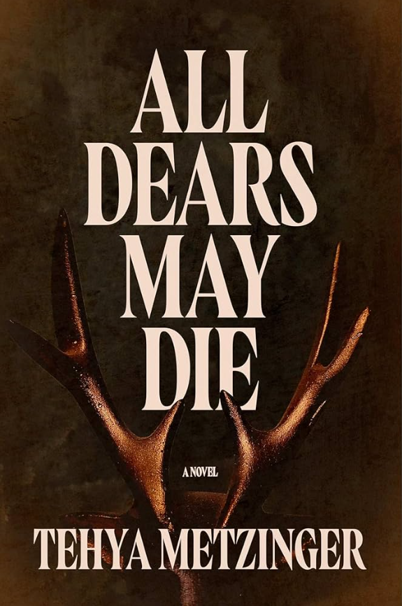
Now I was ready to look for a designer, which was easy for me. I loved the work that Ashton M. Smith was doing (such as her work on All Dears May Die by Tehya Metzinger) and I already followed her on Instagram, so I reached out via her website and she sent me a quote. I highly recommend finding designers you like on social media and following them, not only to eventually reach out in the future, but also to keep your ear to the ground in the book design world. I also love seeing beautiful book covers all over my feed!
Working with Ashton was easy. She sent over a questionnaire that covered the information she needed about my book and what I was looking for, and then she sent over a couple of design concepts that matched what I had communicated, with examples. I chose a direction (bold typography with a single image) and then she started working on the first draft.
I swear, it was like she read my mind, because the first draft was 90% there. Whether it be design telepathy (maybe) or her handy-dandy questionnaire (probably), she locked into exactly what I was going for and delivered. From there, it was a few small tweaks (using a right hand instead of a left, adjusting lighting a little, playing with the fingers going through the typography) and the design of the interior.
I worked with Marta Riva (@marta.intotheforest on Instagram) to create the map, chapter header illustration, and scene break illustrations. I had so much fun coming up with the visuals of my fantasy creatures with her! I also worked with Anna Jones (@wolfmumma on Instagram) to create the hand and dagger illustration at the end of the book, a piece of art that encapsulates the feeling of the book as a whole. I had that artwork made in advance of the book design, and then I was able to give that to Ashton for her to work into the book.
Finally, I proposed that we invert chapter 44 so that the pages are black and the text is paper-white (iykyk), as well as adjust the chapter header for the few chapters with different POVs. It all turned out so well, and I’m just as proud of the interior as I am of the cover!
And voila! The Speak with the Dead book design was born! I’ve had an amazingly positive experience working with the creators in the book community. If you take away one piece of advice from this blog, I hope it’s to reach out to the creatives you want to work with. The worst they can say is that they don’t have time for your project or that it’s over your budget, and the alternative is that you get to work with some awesome people and make connections in the community. Then you all get to cheer for each other!
Here are the links to the websites of the wonderful people I’ve worked with, check them out!
https://intotheforestillustrations.com/
https://www.instagram.com/wolfmumma/
Here is a link to my shop, where you can buy some of the art from the book as well as other cool merch:
https://www.ec-taylor.com/shop